Today we will look at how we can visualise environmental data in combination with a forecast model in an interactive dashboard and then make it available to our users. We will first create a dashboard with R Shiny and finally deploy it via Heroku.
Since Corona, everyone knows them: dashboards. These are interactive data visualisations that allow users, for example, to filter the displayed data through inputs or to manipulate the way it is displayed. Dashboards thus offer extremely low-threshold access to sometimes very complex data sets and are now indispensable in companies, but also, for instance, in the media.
So what do we need for today's exercise?
First of all, data. This data comes from a weather station in Kaiserslautern in Rhineland-Palatinate and was obtained via the NCEI data ordering services of the National Oceanic and Atmospheric Administration.
On the basis of this data, a Shiny app was then built, which also includes an option for time series analysis and forecasting. Finally, this app had to be packed onto a server; the service Heroku was used for this.
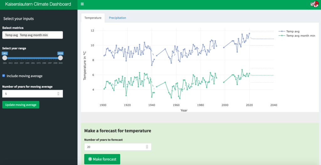
And this is what the final product looks like:
If you want to try it out in action, click here.
And now, let's get started.
Shiny apps always have three parts: a user interface function (analogous to the frontend), a server function (analogous to the backend) and finally the function shinyApp(). For our app, we pack all these parts into one script and call it app.R. We will see why we choose this name below.
In this script, we first load all the libraries we need for our app and then our data.
# Libraries
library("shiny")
library("shinydashboard")
library("shinyjs")
library("ggplot2")
library("dplyr")
library("readr")
library("zoo")
library("forecast")
library("plotly")

# Load data ----
dat <- read_csv(file = "KA_Climate_year_clean.csv")
We need two small helper functions. These serve to display the variable names in our data set in the app in a more attractive way. Underscores are replaced by spaces, lowercase initial letters by capital ones.
#Helper functions ----
metric_choices <- colnames(dat)[2:ncol(dat)]
metric_names <- gsub("_", " ", metric_choices)
metric_names <- paste0(toupper(substr(metric_names,1,1)), substr(metric_names,2,nchar(metric_names)))
metric_list <- as.list(metric_choices)
names(metric_list) <- metric_names

name_fix <- function(x){
  s1 <- gsub("_", " ", x)
  s2 <- paste0(toupper(substr(s1,1,1)), substr(s1,2,nchar(s1)))
  return(s2)
  }
Now we get down to the nitty-gritty with the ui() function, i.e. the user interface.
Then we set the frame for the sidebar. Not much actually happens here, except that we make JavaScript available for a small effect (shinyjs) and refer to the inputs defined in the server function (uiOutput).
Then we come to the dashboard body under "Panels". Here we first define that we want to have two tabs in the app; one for temperature and one for precipitation. The corresponding plot and the forecast panel are then called up in the respective tab.
# UI ----
ui <- dashboardPage(

  skin = "green",

  #### Header ----
  dashboardHeader(
    title = "Kaiserslautern Climate Dashboard",
    titleWidth = 350,
    tags$li(a(href = 'https://zubrod-eds.de', target="_blank",
              img(src = 'Mail_Logo.png',
                  title = "Zubrod EDS", height = "30px"),
              style = "padding-top:10px; padding-bottom:10px;"),
            class = "dropdown")
  ),

  #### Sidebar ----
  dashboardSidebar(

    shinyjs::useShinyjs(),

    width = 350,
    br(),
    h4("Select your inputs ", style = "padding-left:20px"),

    uiOutput("sidebar")

  ),

  #### Panels ----
  dashboardBody(
    tabsetPanel(
      type = "tabs",
      id = "tab_selected",
      tabPanel(
        title = "Temperature",
        plotlyOutput("temp_plot"),
        uiOutput("temp_forecast_panel")
      ),
      tabPanel(
        # 2 - Regional View ----
        title = "Precipitation",
        plotlyOutput("prec_plot"),
        uiOutput("prec_forecast_panel")
      )
    )
  )
)
Now it gets a little more complex in the server function. I am therefore presenting it below in small chunks. But you can also have look at the complete script in my GitHub repository.
First, we need a logical control for the predictions. Every time the app is reloaded and every time a tab is changed, the default state (i.e. no prediction) should be reached.
Then the data is filtered (based on the chosen time period) and selected (based on the chosen metrics) according to the user inputs.
# Server ----
server <- function(input, output) {

  #### Control forecast ----
  make_forecast_temp <- reactiveValues(value=0)
  make_forecast_prec <- reactiveValues(value=0)

  observeEvent(input$tab_selected, {
    make_forecast_temp$value <- 0
    make_forecast_prec$value <- 0
  })

  #### Clean data ----
  clean_data <- reactive({
    req(input$year_range)
    dat %>%
    filter(year >= input$year_range[1] & year <= input$year_range[2]) %>%
    select(year, input$metric) %>%
    arrange(year)
  })
Then we arrive at the somewhat huge plot function that makes use of the Plotly package, which acts as an interactive wrapper around ggplot. After some minor preliminary work, we quickly arrive at a loop that is run once for each metric selected by the user and adds a trace to the plot for each metric.
Within the loop there are then two if statements. The first one checks whether the user is requesting a moving average. If so, this is calculated and also added to the plot as a trace.
The second if statement is used for prediction. If desired by the user, an Auto-ARIMA (AutoRegressive Integrated Moving Averages) is used for time series analysis. For this, three additional traces are added to the plot for each metric: the mean prediction and the lower and upper 95% confidence limits.
If you try this out later in the app: the Auto-ARIMA predictions are relatively meaningless, as they only produce a constant value. Either Auto-ARIMA was not the tool of choice here or the data does not contain a clear trend. But my point here was to introduce you to the technical implementation of model predictions in a dashboard and Auto-ARIMA is sufficient for this purpose.
Finally, in this section we render the plots so that they can be transferred to the user interface.
  #### Plot data ----
  plot_data <- function(data){
    L <- colnames(data)[2:ncol(data)]
    x <- list(title = "Year")
    ifelse(input$tab_selected == "Temperature", y <- list( title = "Temperature in °C"),
           y <- list( title = "Precipitation in mm"))
    coleurs <- c("orange", "blue", "green", "red", "purple")
    plt <- plot_ly(data = data)
    for(k in 1:length(L)) {
      dfk <- data.frame(y=data[[L[k]]], year=data$year)
      plt <- add_trace(plt, y=~y, x=~year, data=dfk,
                       type="scatter", mode="lines+markers", name = name_fix(L[k]),
                       color = coleurs[k], hovertemplate = paste(
                         paste0('<extra>Actuals</extra>',name_fix(L[k]),': %{y}\nYear: %{x}'))
      )
      if( input$moving_average == TRUE & !is.null(input$moving_average_years) ){
        dfk <- data.frame(y=rollmean(data[[L[k]]],ma_years(),mean,align='right',fill=NA),
                          year = data$year)

        plt <- add_trace(plt, y=~y, x=~year, data=dfk,
                         type="scatter", mode='lines', line=list(dash="dash"), showlegend=F,
                         name = name_fix(L[k]), color = coleurs[k], hovertemplate = paste(
                           paste0('<extra>Moving average</extra>',name_fix(L[k]),': %{y}\nYear: %{x}'))
        )
      }
      if( make_forecast_temp$value == 1 | make_forecast_prec$value == 1 ){
        auto_forecast <-  forecast(auto.arima(data[L[k]]),forecast_years())
        new_years <- max(data$year) + c(1:forecast_years())
        dfk <- data.frame(mean=auto_forecast$mean, lcl=auto_forecast$lower[2],
                          ucl=auto_forecast$upper[2], year = new_years)

        plt <- add_trace(plt, y=~mean, x=~year, data= dfk,
                         type="scatter", mode='lines', line=list(dash="dot"), showlegend=F,
                         name = name_fix(L[k]), color = coleurs[k], hovertemplate = paste(
                           paste0('<extra>Forecast mean</extra>',name_fix(L[k]),': %{y}\nYear: %{x}'))
        )
        plt <- add_trace(plt, y=~lcl, x=~year, data= dfk,
                         type="scatter", mode='lines', line=list(dash="dot", width=0.5), showlegend=F,
                         name = name_fix(L[k]), color = coleurs[k], hovertemplate = paste(
                           paste0('<extra>Forecast LCL</extra>',name_fix(L[k]),': %{y}\nYear: %{x}'))
        )
        plt <- add_trace(plt, y=~ucl, x=~year, data= dfk,
                         type="scatter", mode='lines', line=list(dash="dot", width=0.5), showlegend=F,
                         name = name_fix(L[k]), color = coleurs[k], hovertemplate = paste(
                           paste0('<extra>Forecast UCL</extra>',name_fix(L[k]),': %{y}\nYear: %{x}'))
        )

      }

    }
    plt <- layout(plt, title = '', yaxis = y, xaxis = x)
    highlight(plt)
  }

  ##### Render plots ----
  output$temp_plot <- renderPlotly({
    req( input$metric )
    if( input$tab_selected == "Temperature"){
    return(plot_data( clean_data() ) )
    }
  })

  output$prec_plot <- renderPlotly({
    req( input$metric )
    if( input$tab_selected == "Precipitation"){
      return(plot_data( clean_data() ) )
    }
  })
An app would be nothing without buttons. Therefore, we now take care of their behaviour; that is, what happens when which button is pressed. And finally, we define a small JavaScript animation that controls the fading in and out of the Moving Average menu.
  #### Buttons ----
  ma_years <- eventReactive(input$moving_average_bttn,{
    req(input$moving_average_years)
    input$moving_average_years
  },ignoreNULL = FALSE)

  observeEvent(input$temp_forecast_bttn, {
    if(input$tab_selected=="Temperature"){
    make_forecast_temp$value <- 1
    }
  })

  observeEvent(input$prec_forecast_bttn, {
    if(input$tab_selected=="Precipitation"){
      make_forecast_prec$value <- 1
    }
  })

  observeEvent(input$temp_remove_forecast_bttn, {
    if(input$tab_selected=="Temperature"){
      make_forecast_temp$value <- 0
    }
  })

  observeEvent(input$prec_remove_forecast_bttn, {
    if(input$tab_selected=="Precipitation"){
      make_forecast_prec$value <- 0
    }
  })

  temp_forecast_years <- eventReactive(input$temp_forecast_bttn,{
    input$temp_forecast
  })

  prec_forecast_years <- eventReactive(input$prec_forecast_bttn,{
    input$prec_forecast
  })

  forecast_years <- reactive( {
    if (input$tab_selected == "Temperature" & make_forecast_temp$value == 1){
      forecast_years <- temp_forecast_years()
    } else if (input$tab_selected == "Precipitation" & make_forecast_prec$value == 1){
      forecast_years <- prec_forecast_years()
    }
  })

  #### Fade-in moving average ----
  observeEvent(input$moving_average, {
    if( input$moving_average == TRUE )
      shinyjs::show(id = "moving_average_years", anim = TRUE, animType = "fade")
    else {
      shinyjs::hide(id = "moving_average_years", anim = TRUE, animType = "fade")
    }
  })
Now to the last part of the app, where we render all the inputs that are passed to the user interface. That's a lot of select, slider and button inputs, especially because we have to duplicate most of it for both tabs of the app. A lot of work 😉
But the third and last part is done with only one line of code. We pass the ui and server functions to ShinyApp() and get our app object.
  #### Inputs ----

  output$metric_temp <- renderUI({
    selectInput(
      inputId = "metric",
      label = strong("Select metrics", style = "font-family: 'arial'; font-si28pt"),
      choices =  metric_list[1:5],
      selected = metric_list[1],
      multiple = TRUE
    )
  })

  output$metric_prec <- renderUI({
    selectInput(
      inputId = "metric",
      label = strong("Select metrics", style = "font-family: 'arial'; font-si28pt"),
      choices =  metric_list[6:7],
      selected = metric_list[6],
      multiple = TRUE
    )
  })

  output$year_range <- renderUI({
    sliderInput(
      inputId = "year_range",
      label = "Select year range",
      min = 1901,
      max   = 2020,
      value = c(1901, 2020),
      sep = ""
    )
  })

  output$moving_average <- renderUI({
    checkboxInput(
      inputId = "moving_average",
      label = div("Include moving average", style = "font-size: 12pt"),
      #style = "font-size: 28pt",
      value = FALSE
    )
  })

  output$moving_average_years <- renderUI({
    div(
      numericInput(
        inputId = "moving_average_years",
        label = "Number of years for moving average",
        value = 5,
        min = 0,
        max = 30,
        step = 1
      ),
      actionButton(inputId = "moving_average_bttn",
                   style = "color: white;",
                   label = "Update moving average",
                   class = "btn-success"
      )
    )
  })

  output$temp_forecast <- renderUI({
    numericInput(
      inputId = "temp_forecast",
      label = "Number of years to forecast",
      value = 20, min = 0, max = 100, step = 1
    )
  })

  output$prec_forecast <- renderUI({
    numericInput(
      inputId = "prec_forecast",
      label = "Number of years to forecast",
      value = 20, min = 0, max = 100, step = 1
    )
  })

  output$temp_forecast_bttn <- renderUI({
    actionButton(inputId = "temp_forecast_bttn",
                 icon = icon("sun", lib = "font-awesome"),
                 style = "color: white;",
                 label = " Make forecast",
                 class = "btn btn-lg btn-success"
    )
  })

  output$prec_forecast_bttn <- renderUI({
    actionButton(inputId = "prec_forecast_bttn",
                 icon = icon("cloud-rain", lib = "font-awesome"),
                 style = "color: white;",
                 label = " Make forecast",
                 class = "btn btn-lg btn-success"
    )
  })

  output$temp_remove_forecast_bttn <- renderUI({
    actionButton(inputId = "temp_remove_forecast_bttn",
                 icon = icon("ban", lib = "font-awesome"),
                 style = "color: white;",
                 label = "Stop forecast",
                 class = "btn btn-lg btn-danger"
    )
  })

  output$prec_remove_forecast_bttn <- renderUI({
    actionButton(inputId = "prec_remove_forecast_bttn",
                 icon = icon("ban", lib = "font-awesome"),
                 style = "color: white;",
                 label = "Stop forecast",
                 class = "btn btn-lg btn-danger"
    )
  })

  text <- div(
        br(),
        br(),
        strong("This dashboard is part of the ",
                a("Environmental Data Science Playground",
                href="https://zubrod-eds.de/en/playground/",
                target="_blank")),
        br(),
        br(),
        strong("Data was retrieved  from ", a("NOAA",
                                              href="https://www.noaa.gov",
                                              target="_blank")),
        br(),
        br(),
        br()
      )

  output$temp_forecast_panel <- renderUI({
    div(
      class = "jumbotron",
      div(
        class = "container bg-success",
        br(),
        p(strong("Make a forecast for temperature")),
        uiOutput("temp_forecast"),
        uiOutput("temp_forecast_bttn"),
        br(),
        uiOutput("temp_remove_forecast_bttn"),
        br(),
        text
      )
    )
  })

  output$prec_forecast_panel <- renderUI({
    div(
      class = "jumbotron",
      div(
        class = "container bg-success",
        br(),
        p(strong("Make a forecast for precipitation")),
        uiOutput("prec_forecast"),
        uiOutput("prec_forecast_bttn"),
        br(),
        uiOutput("prec_remove_forecast_bttn"),
        br(),
        text
        )
    )
  })

  output$sidebar <- renderUI({
    if( input$tab_selected == "Temperature"){
      div(
        uiOutput("metric_temp"),
        uiOutput("year_range"),
        uiOutput("moving_average"),
        uiOutput("moving_average_years") %>% hidden()
      )
    } else if ( input$tab_selected == "Precipitation" ) {
      div(
        uiOutput("metric_prec"),
        uiOutput("year_range"),
        uiOutput("moving_average"),
        uiOutput("moving_average_years") %>% hidden()
      )
    }
  })

}

shinyApp(ui, server)
That's it. We have built a small climate dashboard and can run it locally by executing the script (install all libraries first!).
OK. But what if we want to share this app with others????
There are numerous ways to deploy Shiny apps, and many providers even specialise in Shiny. But I want to show you a service here that is just not that and can therefore also host apps that were produced with other frameworks: Heroku.
To do this, however, we first need two mini-scripts, an init.R (this installs all your libraries that are needed for your app, if they are not available) and a run.R. Because of the naming conventions of Heroku, we had also named our app script app.R, by the way.
# init.R
# Load/install libraries ----

my_packages = c("shinydashboard", "shinyjs", "ggplot2", "dplyr", "readr",
                "forecast", "plotly", "zoo")
install_if_missing = function(p) {
  if (p %in% rownames(installed.packages()) == FALSE) {
    install.packages(p)
  }
}
invisible(sapply(my_packages, install_if_missing))
# run.R
library(shiny)
port <- Sys.getenv('PORT')
shiny::runApp(
appDir = getwd(),
host = '0.0.0.0',
port = as.numeric(port)
)Now we are ready to go. Put these three R scripts and all the other files you need for your app into a local folder and add them to a new GitHub repository. If you've never done this before, here are step-by-step instructions. Then create a Heroku account (currently completely free, provided you accept certain restrictions). Now you have two options. Either you work via Heroku's CLI (i.e. via the command line) or, and this works even more comfortably, you link your GitHub repository with Heroku.
Three more tips to ensure that the build and deployment of your apps goes smoothly.
1) Make sure to load and install all necessary libraries via app.R and init.R.
2) Do not use unnecessary libraries. Heroku has a fixed time limit of 15 minutes for the build of an app. If this is exceeded, it terminates. Due to the many dependencies when using several libraries, it is very easy to break the time limit. So, for example, do not load the entire tidyverse, but only the components you need.
3) Pay attention to the naming conventions: app.R (or ui.R and server.R), init.R and run.R.
Done 🙂
Here again is the link to the Shiny app hosted on Heroku to try out and play around with 😉
If you have any questions, comments, ideas about this post, feel free to drop me an e-mail.